Repository navigation
Give the error row dismiss button a padded hit area - #102900
Conversation


Co-authored-by: Eugene Voloshchak <eVoloshchak@users.noreply.github.com>

 melvin-bot
Bot
added
Melvin-Test-Android
Melvin-Test-Web

|
I created this PR from an upstream branch since I don't have push access to your fork. To take ownership of this branch and be able to push updates, run: Then you can close this PR and open a new one from your fork. |

Codecov Report✅ Changes either increased or maintained existing code coverage, great job!
|
|
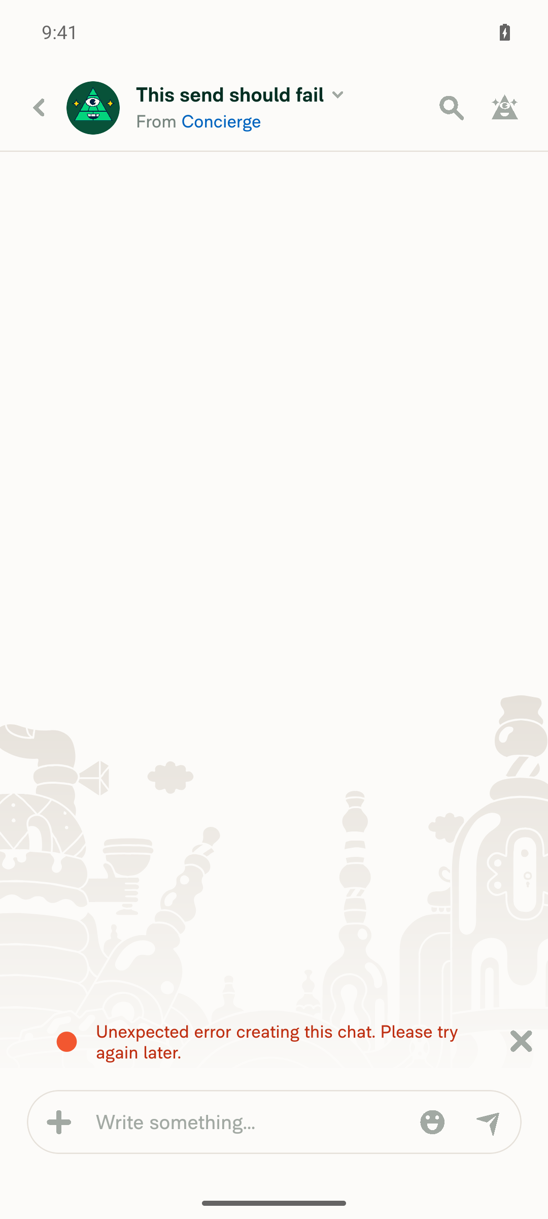
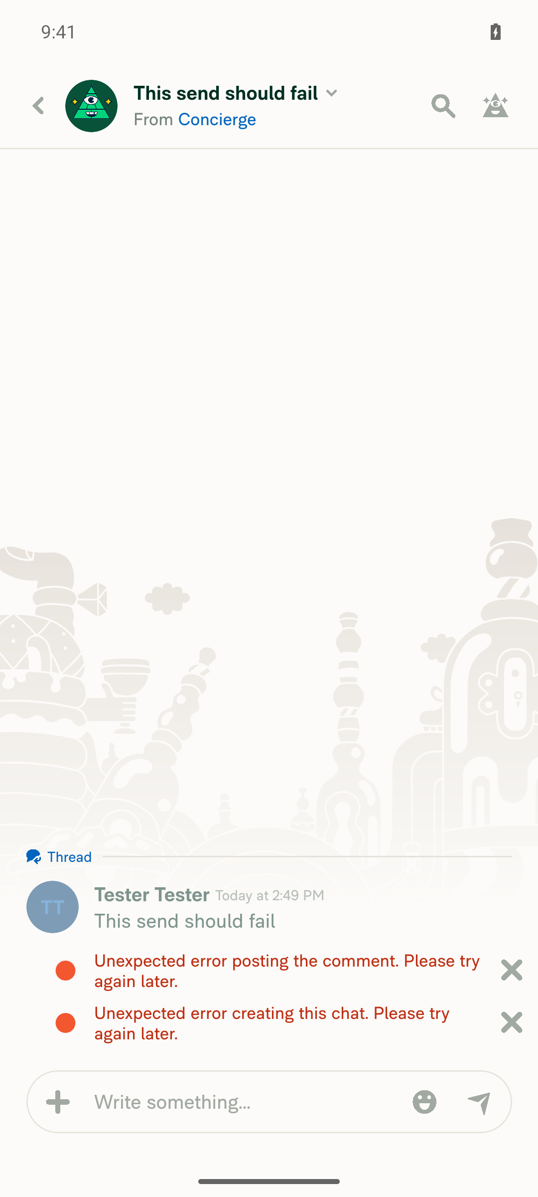
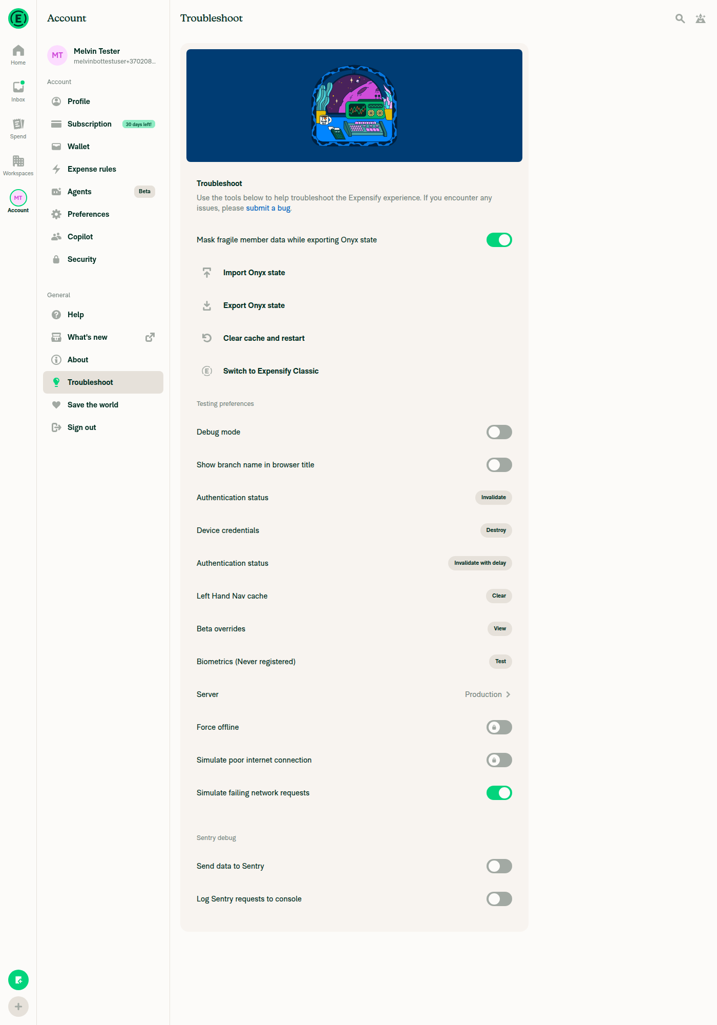
🤖 Android test steps verification results: ✅ pass On standalone Android NewDot, the dismiss "X" now has a 40×40dp hit area with even padding on all sides, and tapping it dismisses the error row. The exact "report status has changed" server error can't be produced from the client, so I used Troubleshoot > "Simulate failing network requests" to create a real report-action error in the same
|
|
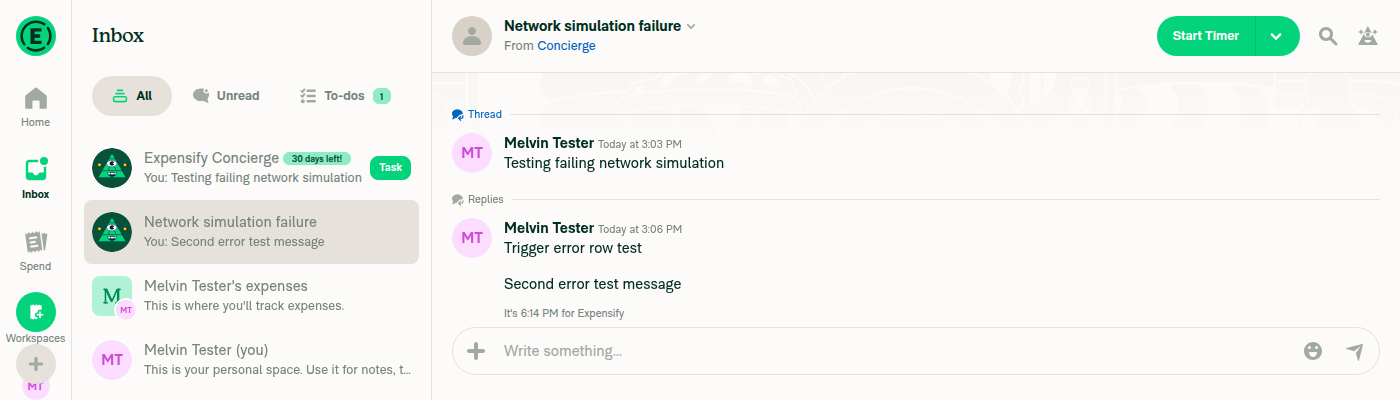
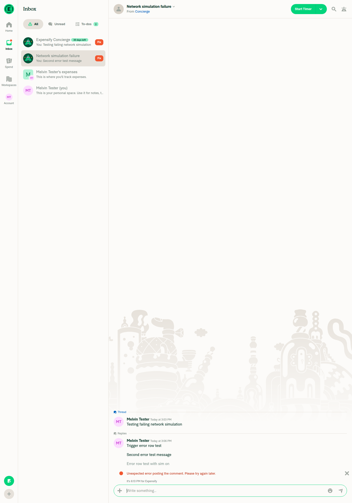
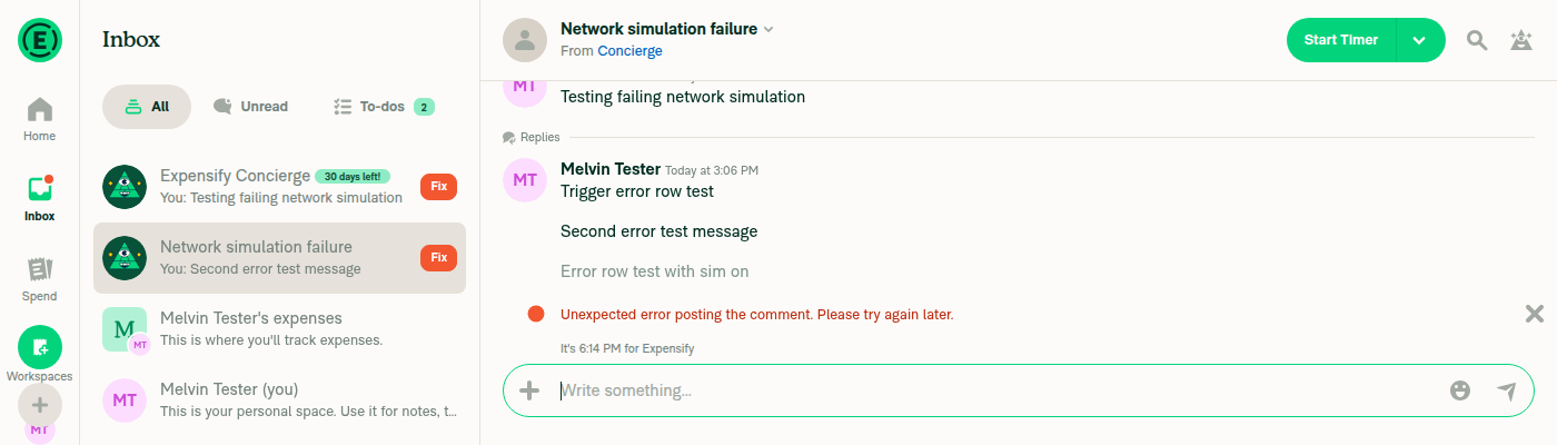
🤖 Web test steps verification results: On dev NewDot web, the dismiss "X" has visible padding on all sides, and clicking it dismisses the error row. I could not read the JS console or measure the exact 40×40 hit area with the web tooling, so those two checks rely on visual evidence only.
|

|
@MelvinBot, pull the latest main |
…missButtonPadding

Co-authored-by: Eugene Voloshchak <eVoloshchak@users.noreply.github.com>
|
@MelvinBot, pull the latest main |
…missButtonPadding

Co-authored-by: Eugene Voloshchak <eVoloshchak@users.noreply.github.com>
|
🤖 I merged the latest |
Reviewer Checklist
Screenshots/VideosAndroid: HybridApp
Android: mWeb Chrome
iOS: HybridApp
iOS: mWeb Safari
MacOS: Chrome / Safarihttps://github.com/user-attachments/assets/b3b156b2-2c1d-4bed-8f1b-e11c355db00a |

|
|
|
🤖 I updated the PR description:
|
|
@Expensify/design, could you review this one please? How does this look? Before
|


|
That looks better to my eyes 👍 |

|
Same here 👍 |
|
@MelvinBot, mark this as ready for review |
|
I marked this PR as ready for review. |

|
@eVoloshchak Please copy/paste the Reviewer Checklist from here into a new comment on this PR and complete it. If you have the K2 extension, you can simply click: [this button] |

Codex Review SummaryThis comment shows the latest Codex review activity on this pull request.
ℹ️ About Codex in GitHubYour team has set up Codex to review pull requests in this repo. Reviews are triggered when you
Codex reacts with 👀 while any review is running, comments if it has suggestions, and reacts with 👍 once all reviews finish with no findings. |


There was a problem hiding this comment.
💡 Codex Review
Here are some automated review suggestions for this pull request.
Reviewed commit: 6d5e4ee484
ℹ️ About Codex in GitHub
Codex has been enabled to automatically review pull requests in this repo. Reviews are triggered when you
- Open a pull request for review
- Mark a draft as ready
- Comment "@codex review".
If Codex has suggestions, it will comment; otherwise it will react with 👍.
When you sign up for Codex through ChatGPT, Codex can also answer questions or update the PR, like "@codex address that feedback".
| <Tooltip text={dismissText}> | ||
| <PressableWithoutFeedback | ||
| onPress={onDismiss} | ||
| style={styles.touchableButtonImage} |
There was a problem hiding this comment.

When a room-creation error is rendered by ReportActionItemCreated, that caller still passes errorRowStyles={[styles.ml10, styles.mr2, styles.mb2]} at src/pages/inbox/report/ReportActionItemCreated.tsx:70. The new 40px pressable already places the 20px icon 10px from the edge, so the retained 8px right margin moves this dismiss icon 18px inward, unlike the equivalent report-action error rows updated in this commit. Remove styles.mr2 from that caller as well so this error state gets the intended alignment.
Useful? React with 👍 / 👎.

There was a problem hiding this comment.
🤖 I removed styles.mr2 from the created-action error row and pushed it (b0434db0). The row now uses [styles.ml10, styles.mb2] in ReportActionItemCreated.tsx:70. This matches the other report-action error rows.
One more caller still passes styles.mr2: the wallet terms error row in WalletPage/index.tsx:895. Its dismiss "X" now sits 18px from the edge. Do you want me to remove it there too?
I couldn't run lint or Prettier in this environment. The change only removes one array item, so CI should confirm it.
Co-authored-by: Eugene Voloshchak <eVoloshchak@users.noreply.github.com>
|
@AndrewGable Please copy/paste the Reviewer Checklist from here into a new comment on this PR and complete it. If you have the K2 extension, you can simply click: [this button] |


|
✋ This PR was not deployed to staging yet because QA is ongoing. It will be automatically deployed to staging after the next production release. |

|
🚧 AndrewGable has triggered a test Expensify/App build. You can view the workflow run here. |
|
🧪🧪 Use the links below to test this adhoc build on Android, iOS, and Web. Happy testing! 🧪🧪
|


|
🚀 Deployed to staging by https://github.com/AndrewGable in version: 9.5.21-0 🚀
|
|
No help site update is needed. This PR only adds padding around the dismiss "X" on error rows, so no help article sentence becomes incorrect. |
|
🚀 Deployed to staging by https://github.com/AndrewGable in version: 9.5.23-0 🚀
|
|
No help site update is needed. This PR only adds padding around the dismiss "X" on error rows, so no help article sentence becomes incorrect. |
|
🚀 Deployed to production by https://github.com/jasperhuangg in version: 9.5.23-3 🚀
Bundle Size Analysis (Sentry): |


Explanation of Change
The dismiss "X" in
MessagesRow(the error row rendered byOfflineWithFeedback→ErrorMessageRow) was a bare 20×20 icon inside aPressableWithoutFeedbackwith no style. Its hit area was only the glyph, and the only spacing came from the row's horizontal margins. That is why the "X" looked cramped, with no vertical padding.This PR:
styles.touchableButtonImage(40×40, centered) to the dismiss pressable inMessagesRow. This is the same style other close buttons use (for examplePinButton,ReferralProgramCTA). The icon now has 10px of padding on every side, and the fix applies to everyMessagesRowconsumer.styles.mr2fromerrorRowStyleson the report action error rows (ReportActionItem,ReportActionItemParentAction,AncestorReportActionItem). The new padding already places the glyph 10px from the edge, so keepingmr2would push the "X" further inward. Removing it keeps the "X" close to where it was.Note for review: the padded button makes the error row at least 40px tall. Please check compact
MessagesRowuses (for example workspace member rows) and get design sign-off.AI tests run locally:
npm run typecheck: passednpm run linton changed files: passednpm run react-compiler-compliance-check checkon changed files: passednpm testfortests/ui/ReportActionItemTest.tsx,tests/ui/ClearReportActionErrorsUITest.tsx,tests/unit/ReportActionItemSingleTest.tsx: 227 passedFixed Issues
$ #102076
PROPOSAL: #102076 (comment)
Tests
Offline tests
QA Steps
PR Author Checklist
### Fixed Issuessection aboveTestssectionOffline stepssectionQA stepssectionAvatar, I verified the components usingAvatarare working as expected)StyleUtils.getBackgroundAndBorderStyle(theme.componentBG))npm run compress-svg)Avataris modified, I verified thatAvataris working as expected in all cases)Designlabel and/or tagged@Expensify/designso the design team can review the changes.mainbranch was merged into this PR after a review, I tested again and verified the outcome was still expected according to theTeststeps.Screenshots/Videos
Android: Native
Android: mWeb Chrome
iOS: Native
iOS: mWeb Safari
MacOS: Chrome / Safari