This repository was archived by the owner on Feb 13, 2023. It is now read-only.
Feat/responsiveness#3
Open
AlissonRoss wants to merge 8 commits into
Open
Conversation
…HackerPass-Front into feat/responsiveness
Author
|
@athsiao @shawnduong Hi Just adding your names here as I cant seem to add reviewers |
Owner
|
Please remember to follow the contribution guide. @athsiao How's it look? I'll merge if it's good for you. |
This file contains hidden or bidirectional Unicode text that may be interpreted or compiled differently than what appears below. To review, open the file in an editor that reveals hidden Unicode characters.
Learn more about bidirectional Unicode characters
Sign up for free
to subscribe to this conversation on GitHub.
Already have an account?
Sign in.
2 participants
Add this suggestion to a batch that can be applied as a single commit.This suggestion is invalid because no changes were made to the code.Suggestions cannot be applied while the pull request is closed.Suggestions cannot be applied while viewing a subset of changes.Only one suggestion per line can be applied in a batch.Add this suggestion to a batch that can be applied as a single commit.Applying suggestions on deleted lines is not supported.You must change the existing code in this line in order to create a valid suggestion.Outdated suggestions cannot be applied.This suggestion has been applied or marked resolved.Suggestions cannot be applied from pending reviews.Suggestions cannot be applied on multi-line comments.Suggestions cannot be applied while the pull request is queued to merge.Suggestion cannot be applied right now. Please check back later.
Responsiveness
Proposed changes
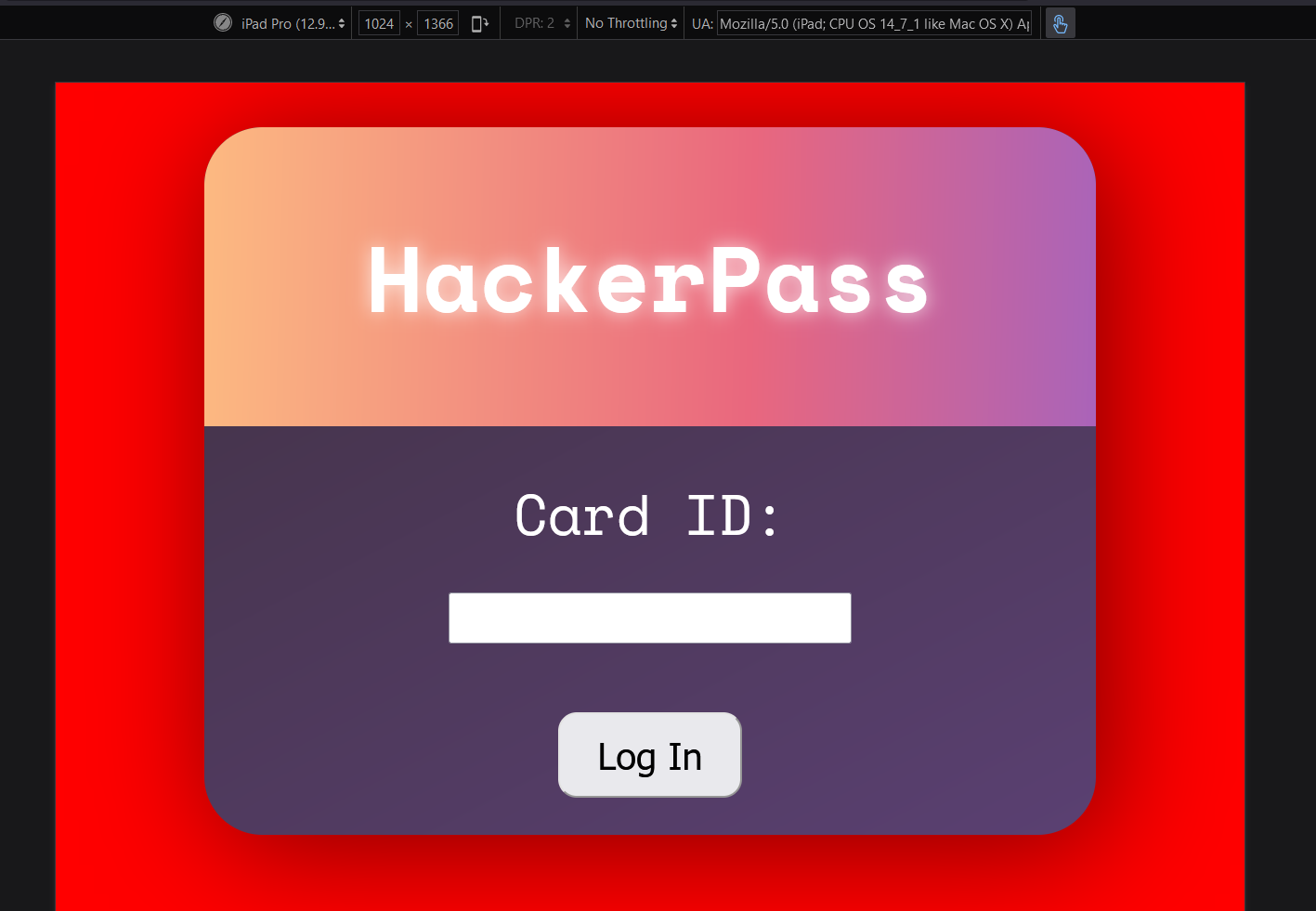
Added more responsiveness for tablet, mobile and desktop view ports for the /web Hackerpass site.
Types of changes
What types of changes does your code introduce to HackerPass?
Put an
xin the boxes that applyResponsiveness
Check off the different browsers and devices you have tested on. Note: testing includes Horizontal and Vertical alignments
Browsers
Devices
Phones
Tablets
Desktops
Screenshots
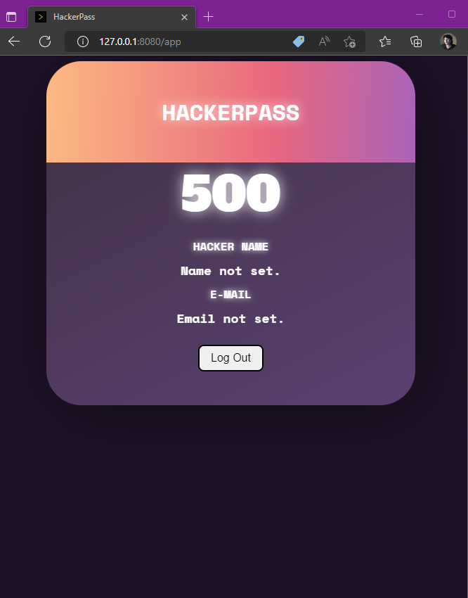
Windows 10 Firefox desktop viewport
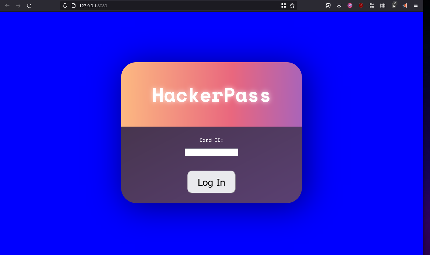
Edge tablet viewport
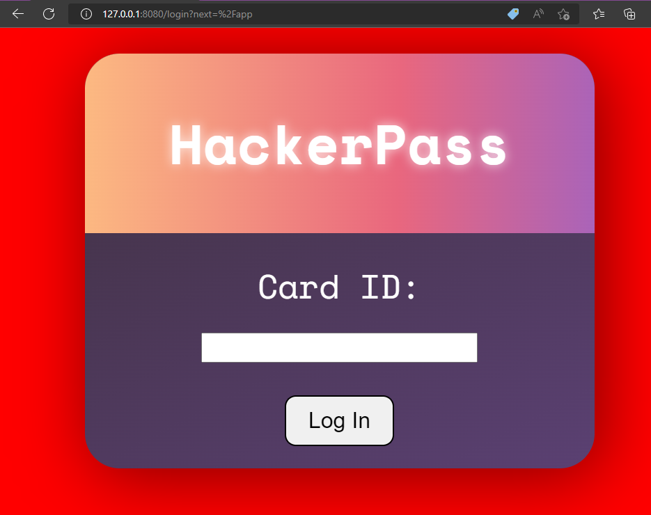
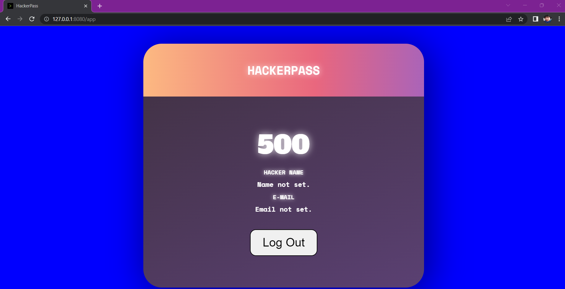
Chrome Desktop viewport
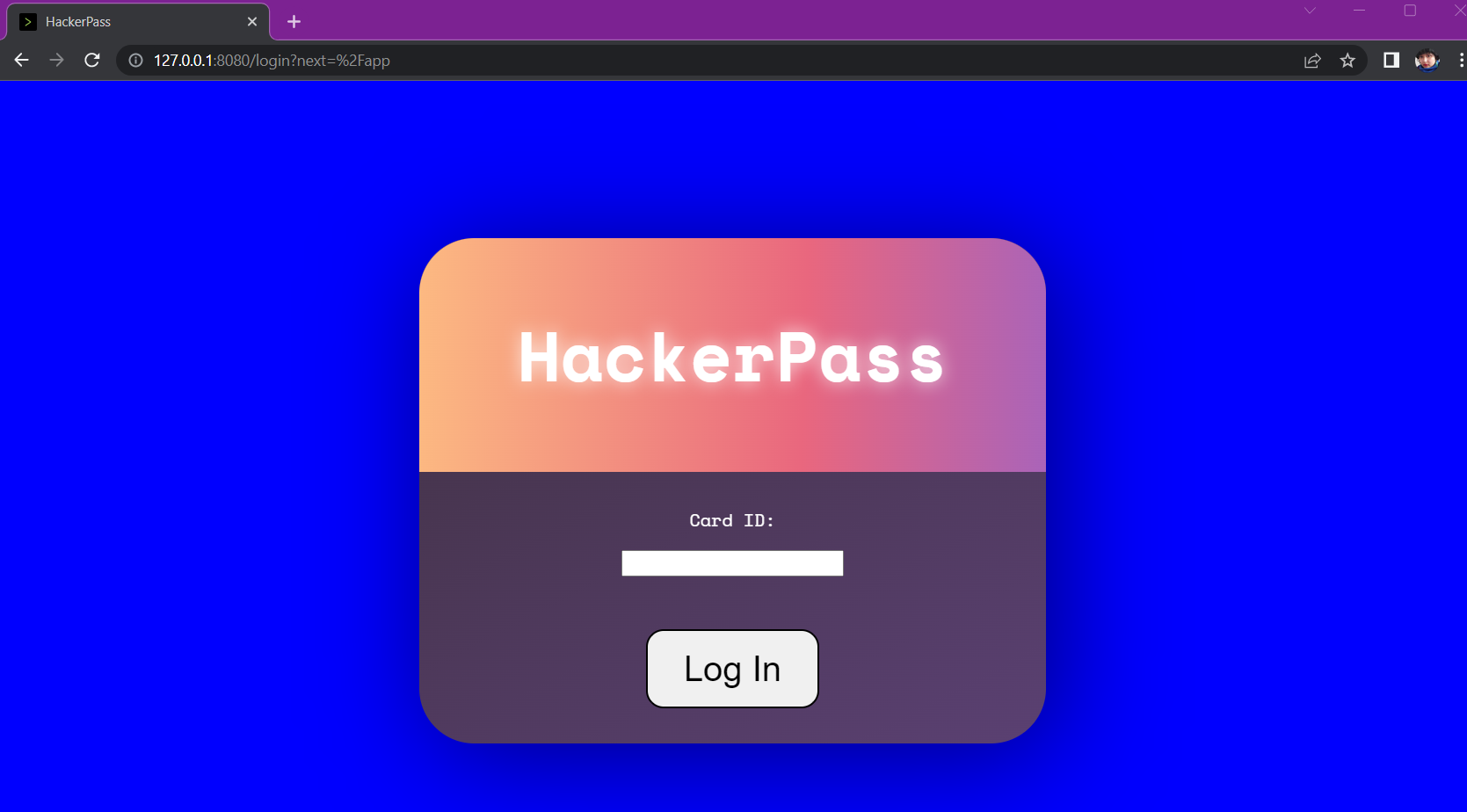
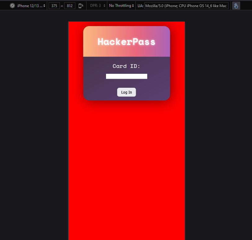
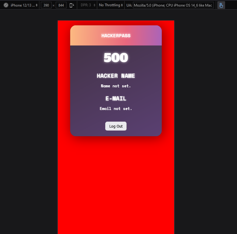
iPhone 12/13 + Pro
Main page
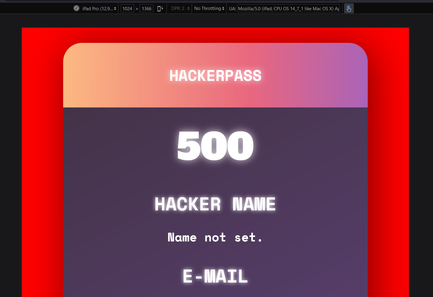
User Info page
iPad Pro
Further comments
There will probably be some further fixes needed for the Desktop view-port once the user points are moved to it's own individual box on the right side of the screen per the design.
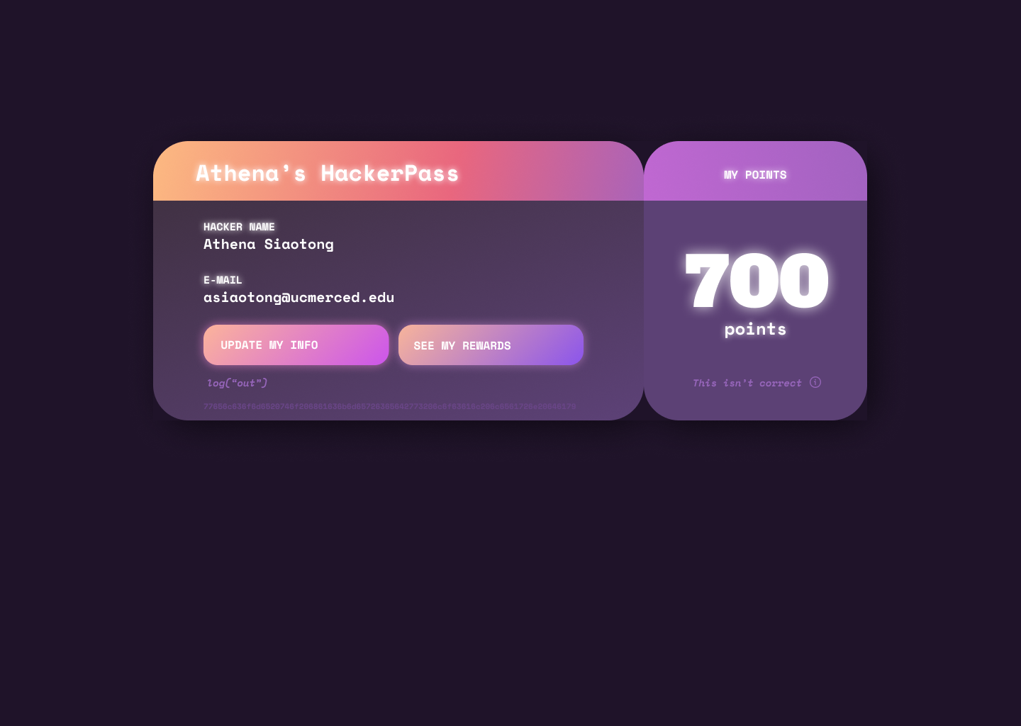
Design:
The purple viewport is currently set to less than 781 px, I guess most phones now have a screen width larger than that.