06. Colour Contrast
The A11Y checklist suggests that colour contrast should be checked across a range of features on a webpage. Poor colour contrast (ie the colours been too close in colour) can be difficult for many users to read.
Lighthouse identifies poor colour contrast and has a handy tool to identify a good colour to use.
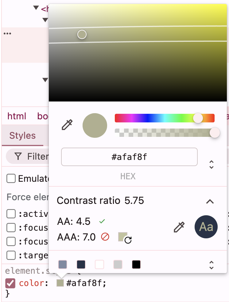
The AA and AAA in the above relate to the WCAG 2.0 guidelines. There are three levels of conformance in order to meet the needs of different groups and different situations: A (lowest), AA (mid range), and AAA (highest).
There are also online tools to help with creating well contrasted colour schemes:
Note
Some issues within the pages can be fixed by applying styling via an improved heading hierarchy.