
👉 Live demo: https://sincerelyfaust.github.io/react-fit-list/
📦 npm: https://www.npmjs.com/package/react-fit-list
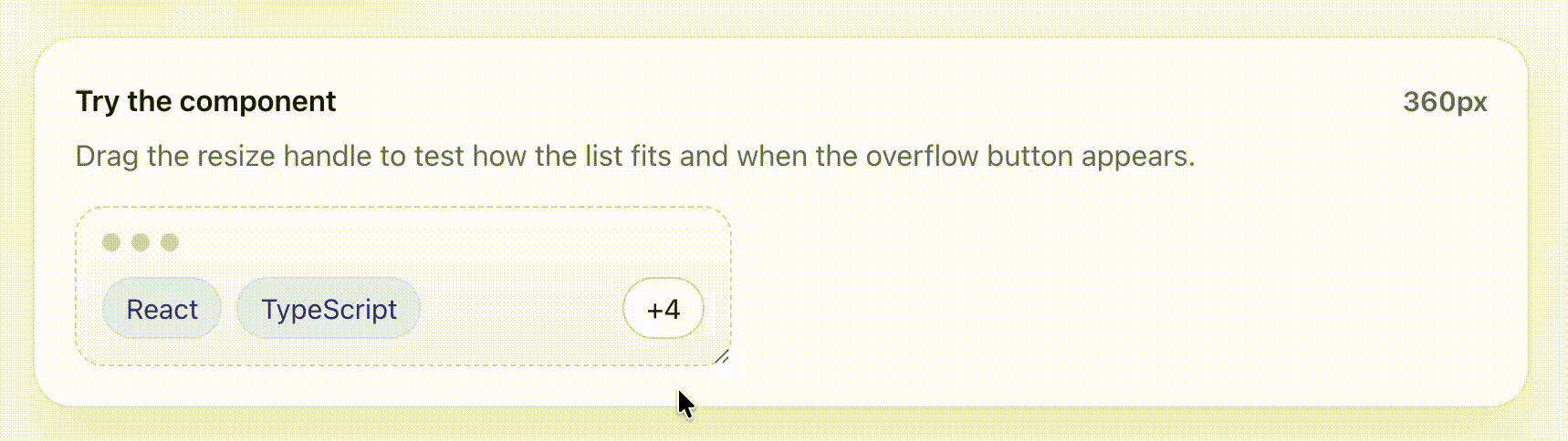
react-fit-list is a headless React utility for responsive lists that collapse overflowing items into a customizable disclosure.
It ships with:
- a ready-to-use
<FitList />component - a headless
useFitList()hook for custom renderers - TypeScript types for component and hook APIs
npm install react-fit-listimport { FitList } from 'react-fit-list'
const items = [
{ id: 1, label: 'Security' },
{ id: 2, label: 'Startups' },
{ id: 3, label: 'Fintech' },
{ id: 4, label: 'B2B SaaS' },
]
export function Example() {
return (
<div style={{ width: 240 }}>
<FitList
items={items}
getItemKey={(item) => item.id}
renderItem={(item) => (
<span
style={{
display: 'inline-flex',
alignItems: 'center',
border: '1px solid #d0d7de',
borderRadius: 999,
padding: '4px 10px',
fontSize: 12,
whiteSpace: 'nowrap',
}}
>
{item.label}
</span>
)}
/>
</div>
)
}Use the component when you want the library to handle the layout, hidden measurement nodes, and default disclosure rendering for you.
| Prop | Type | Default | Description |
|---|---|---|---|
items |
readonly T[] |
— | Items to fit into a single row. |
getItemKey |
(item, index) => React.Key |
— | Returns a stable React key for each item. |
renderItem |
(item, index) => React.ReactNode |
— | Renders a single item. |
renderDisclosure |
(args) => React.ReactNode |
+hiddenCount button |
Renders the control shown when items are hidden. Return a custom button or menu trigger here when you need custom behavior. |
className |
string |
— | Class applied to the root row. |
listClassName |
string |
— | Class applied to the visible-items wrapper. |
itemClassName |
string |
— | Class applied to each visible item wrapper. |
disclosureClassName |
string |
— | Class applied to the default disclosure button. |
rootProps |
HTMLAttributes<HTMLDivElement> |
— | Props spread onto the root container. Useful for roles, labels, data attributes, and event handlers. |
listProps |
HTMLAttributes<HTMLDivElement> |
— | Props spread onto the visible-items wrapper. |
itemProps |
HTMLAttributes<HTMLDivElement> | ((item, index) => HTMLAttributes<HTMLDivElement>) |
— | Props spread onto each visible item wrapper. |
disclosureWrapperProps |
HTMLAttributes<HTMLDivElement> |
— | Props spread onto the disclosure wrapper. |
sizerClassName |
string |
itemClassName |
Class applied to hidden measurement nodes when sizing depends on matching CSS. |
emptyFallback |
React.ReactNode |
null |
Content rendered when items is empty. |
spacing |
number |
8 |
Space between items and the disclosure. |
trimFrom |
'end' | 'start' |
'end' |
Which side of the list hides items first. |
disclosurePlacement |
'edge' | 'adjacent' |
'edge' |
Keep the disclosure at the row edge or place it next to the trimmed side. |
maxVisibleItems |
number |
— | Caps how many items may be shown while the list is closed, even when more items would fit. |
reserveDisclosureSpace |
boolean |
false |
Reserve room for the disclosure even when everything fits. |
disclosureWidth |
number |
auto | Fixed disclosure width in pixels. Useful when the control size is known. |
measureDisclosureWidth |
(hiddenCount: number) => number |
— | Custom disclosure width measurement callback. Useful when a custom disclosure label changes size as the hidden count changes. |
estimateItemWidth |
number | ((item, index) => number) |
fallback 96 |
Width estimate used in estimated mode or before actual measurements are available. |
measurementMode |
'actual' | 'estimated' |
'actual' |
Width calculation strategy. |
open |
boolean |
uncontrolled | Controlled open state. |
defaultOpen |
boolean |
false |
Initial open state for uncontrolled usage. |
onOpenChange |
(open: boolean) => void |
— | Called when open state changes. |
renderDisclosure receives the current fit state plus open-state helpers:
{
  hiddenCount: number
  hiddenItems: T[]
  visibleItems: T[]
  closedVisibleItems: T[]
  closedHiddenItems: T[]
  isOverflowing: boolean
  isOpen: boolean
  setOpen: (open: boolean) => void
  toggleOpen: () => void
}
A custom disclosure can render its own button and event handling. hiddenCount and hiddenItems describe the closed overflow segment, so they stay available even while the list is open:
<FitList
  items={items}
  getItemKey={(item) => item.id}
  renderItem={(item) => <Tag>{item.label}</Tag>}
  renderDisclosure={({ hiddenCount, hiddenItems }) => (
    <button onClick={() => console.log(hiddenItems)}>
      Show {hiddenCount} more
    </button>
  )}
/>Use the hook when you want the fitting calculation but need full control over markup.
import { useFitList } from 'react-fit-list'

const fit = useFitList({
  items,
  getItemKey: (item) => item.id,
  spacing: 8,
})| Option | Type | Default | Description |
|---|---|---|---|
items |
readonly T[] |
— | Items to measure. |
getItemKey |
(item, index) => React.Key |
— | Returns a stable React key for each item. |
spacing |
number |
8 |
Space between items and disclosure. |
trimFrom |
'end' | 'start' |
'end' |
Which side hides items first. |
maxVisibleItems |
number |
— | Caps how many items may be visible while closed. |
reserveDisclosureSpace |
boolean |
false |
Reserve disclosure space even when all items fit. |
disclosureWidth |
number |
auto | Fixed disclosure width in pixels. |
estimateItemWidth |
number | ((item, index) => number) |
fallback 96 |
Width estimate for estimated mode. |
measurementMode |
'actual' | 'estimated' |
'actual' |
Width calculation strategy. |
open |
boolean |
uncontrolled | Controlled open state. |
defaultOpen |
boolean |
false |
Initial open state. |
onOpenChange |
(open: boolean) => void |
— | Called whenever open state changes. |
measureDisclosureWidth |
(hiddenCount: number) => number |
— | Custom disclosure width measurement callback. |
| Field | Type | Description |
|---|---|---|
containerRef |
RefObject<HTMLDivElement | null> |
Attach to the outer container. |
registerItem |
(key) => (node) => void |
Registers visible item nodes for measurement. |
registerMeasureItem |
(key) => (node) => void |
Registers hidden measurement nodes. |
registerDisclosure |
(node) => void |
Registers the disclosure node. |
visibleItems |
T[] |
Items currently visible in the rendered row. When open, this contains all items. |
hiddenItems |
T[] |
Items currently hidden in the rendered row. When open, this is empty. |
hiddenCount |
number |
Number of currently hidden rendered items. When open, this is 0. |
closedVisibleItems |
T[] |
Items that fit while the list is closed. |
closedHiddenItems |
T[] |
Items that overflow while the list is closed. |
closedHiddenCount |
number |
Number of items that overflow while the list is closed. |
isOverflowing |
boolean |
Whether the closed list has overflow items. |
isOpen |
boolean |
Whether the list is open. |
setOpen |
(open: boolean) => void |
Sets open state directly. |
toggleOpen |
() => void |
Toggles open state. |
recompute |
() => void |
Re-runs the fit calculation immediately using current measurements. |
FitList is headless and does not force list semantics, but you can add them with pass-through props:
<FitList
  items={items}
  getItemKey={(item) => item.id}
  renderItem={(item) => <Tag>{item.label}</Tag>}
  rootProps={{ role: 'list', 'aria-label': 'Selected filters' }}
  itemProps={{ role: 'listitem' }}
/>
The default disclosure is a button with aria-expanded and an accessible label. It renders +N while closed and Show less while open.
Use measurementMode="actual" when item widths depend on text, fonts, or CSS. This is the most accurate option and uses hidden measurement nodes.
Use measurementMode="estimated" when you know roughly how wide items are and want cheaper calculations. The fit calculation uses prefix sums internally, so recomputing which items fit is linear in the number of items instead of repeatedly summing visible slices:
<FitList
  items={items}
  getItemKey={(item) => item.id}
  renderItem={(item) => <Tag>{item.label}</Tag>}
  measurementMode="estimated"
  estimateItemWidth={(item) => item.label.length * 8 + 24}
/>On the server, react-fit-list renders from the data you provide and measures after hydration in the browser. Use measurementMode="estimated" with estimateItemWidth when you prefer predictable first-pass sizing over DOM measurement.
The component renders a visually hidden measurement tree so item widths can be calculated without changing the visible layout. Keep renderItem deterministic and use sizerClassName when your item width depends on CSS classes that are not already applied through itemClassName.