Skip to content

feat(single-combo): update single selection combo topics - #1026

Open
Hristo313 wants to merge 9 commits into
vnextfrom
hhristov/update-single-selection-combo-topics
Open

Hristo313 wants to merge 9 commits into
vnextfrom
hhristov/update-single-selection-combo-topics

Conversation

@Hristo313

Copy link
Copy Markdown
Contributor

Closes #722

Update the Single Selection Combo xplat topics

Also updated the samples:
Angular -> IgniteUI/igniteui-angular-samples#4072
React -> IgniteUI/igniteui-react-examples#1139
WC -> IgniteUI/igniteui-wc-examples#1310
Blazor -> IgniteUI/igniteui-blazor-examples#1356

Checklist:

  • check topic's TOC/menu and paragraph headings
  • Include TOC topic labels in the topic content when it has a valuable update, is new, or is considered preview / beta
  • link to other topics using ./page.mdx or ../relative/path.mdx (.mdx extension required)
  • at the References section at the end of the topic add links to topics, samples, etc
  • reference API documentation instead of adding a section with API

  • use valid component names - [Data] Grid, IgxSelectComponent, <igx-combo>
  • use spell checker tool (VS Code, Grammarly, Microsoft Editor)
  • add inline code blocks for the names of classes / tags / properties
  • add language descriptor for the code blocks
  • check if links function by running the check-api/mdx npm commands
  • check if sample is working and fully visible in the topic
  • check if sample is working and fully visible in the StackBlitz
  • check if code blocks match the code in StackBlitz demo
  • add or update meaningful llms.description metadata and run npm run check:llms-metadata


  • do not resolve requested changes (leave that to the reviewer)

@Hristo313 Hristo313 added ❌ status: awaiting-test PRs awaiting manual verification simple combo IgxSimpleCombo component doc-redesign labels Nov 6, 2026
@Hristo313 Hristo313 changed the title feat(single-combo): update single selection overview topics feat(single-combo): update single selection combo topics Nov 6, 2026
@DiLazarova

Copy link
Copy Markdown
Contributor

Review for Combo / React / Chrome
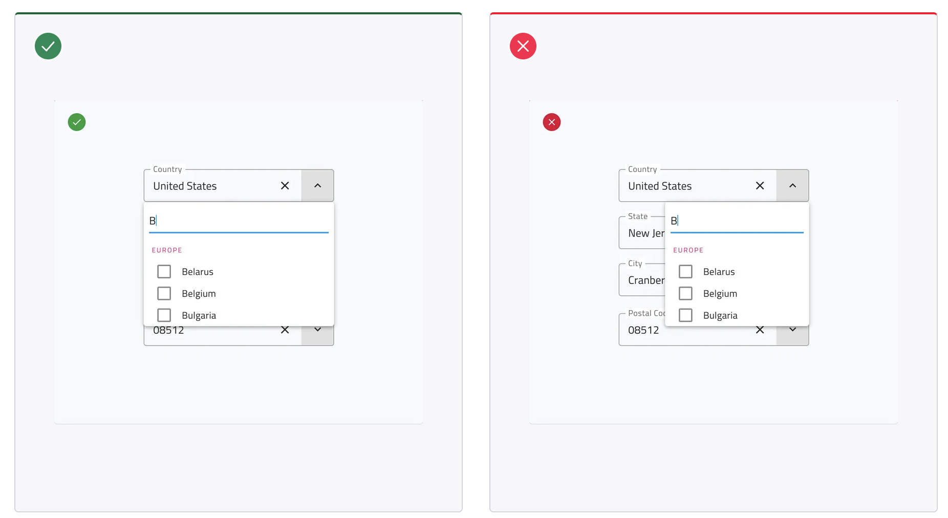
It appears that there are images with the background and icons embedded within the Do/Don/t section's frame.
Screenshot 2026-11-10 at 10 41 14

@DiLazarova

DiLazarova commented Nov 11, 2026 •

Copy link
Copy Markdown
Contributor

Single Combo - Review - React/ Chrome

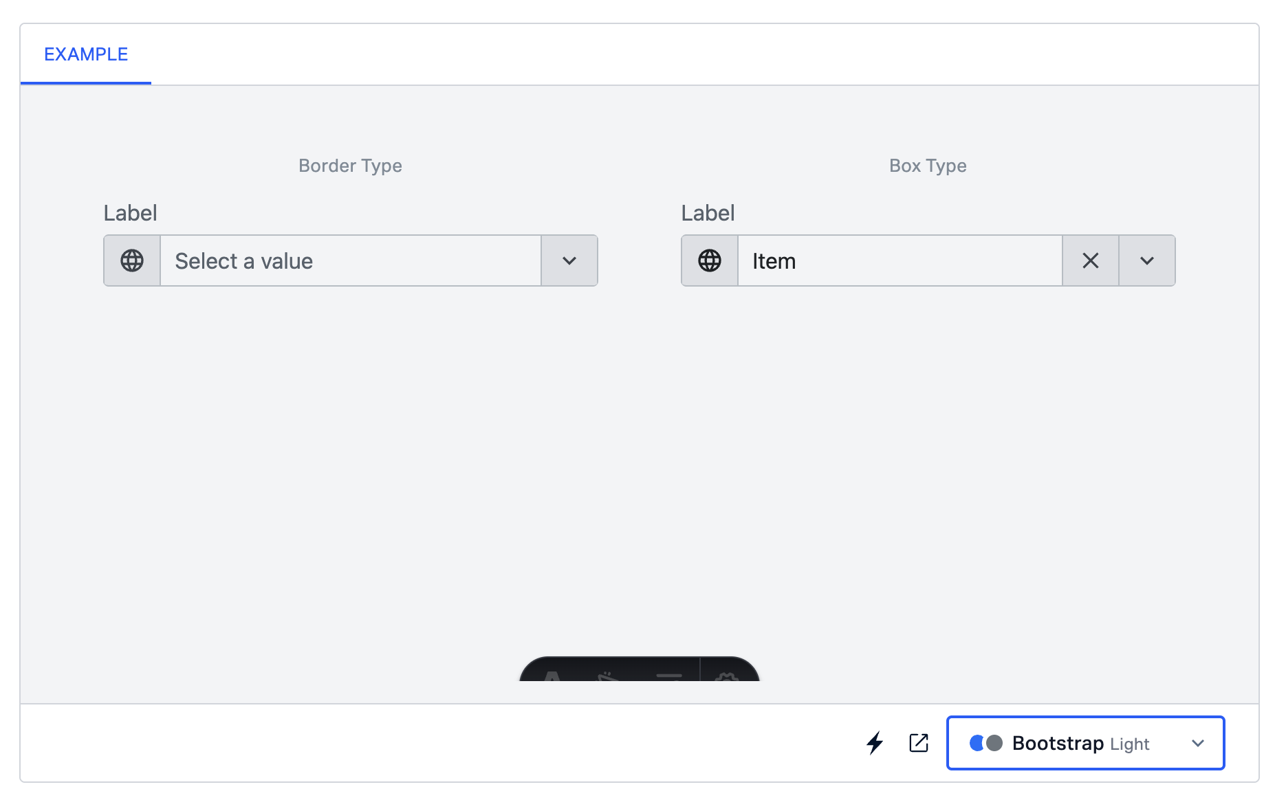
  1. Only “Material Combo” has two types: “Box” and “Border.” The other themes support only one option.
Screenshot 2026-11-11 at 17 44 00

There is one additional example in the Figma File: Figma Design

This should be changed in every other section

@DiLazarova

Copy link
Copy Markdown
Contributor

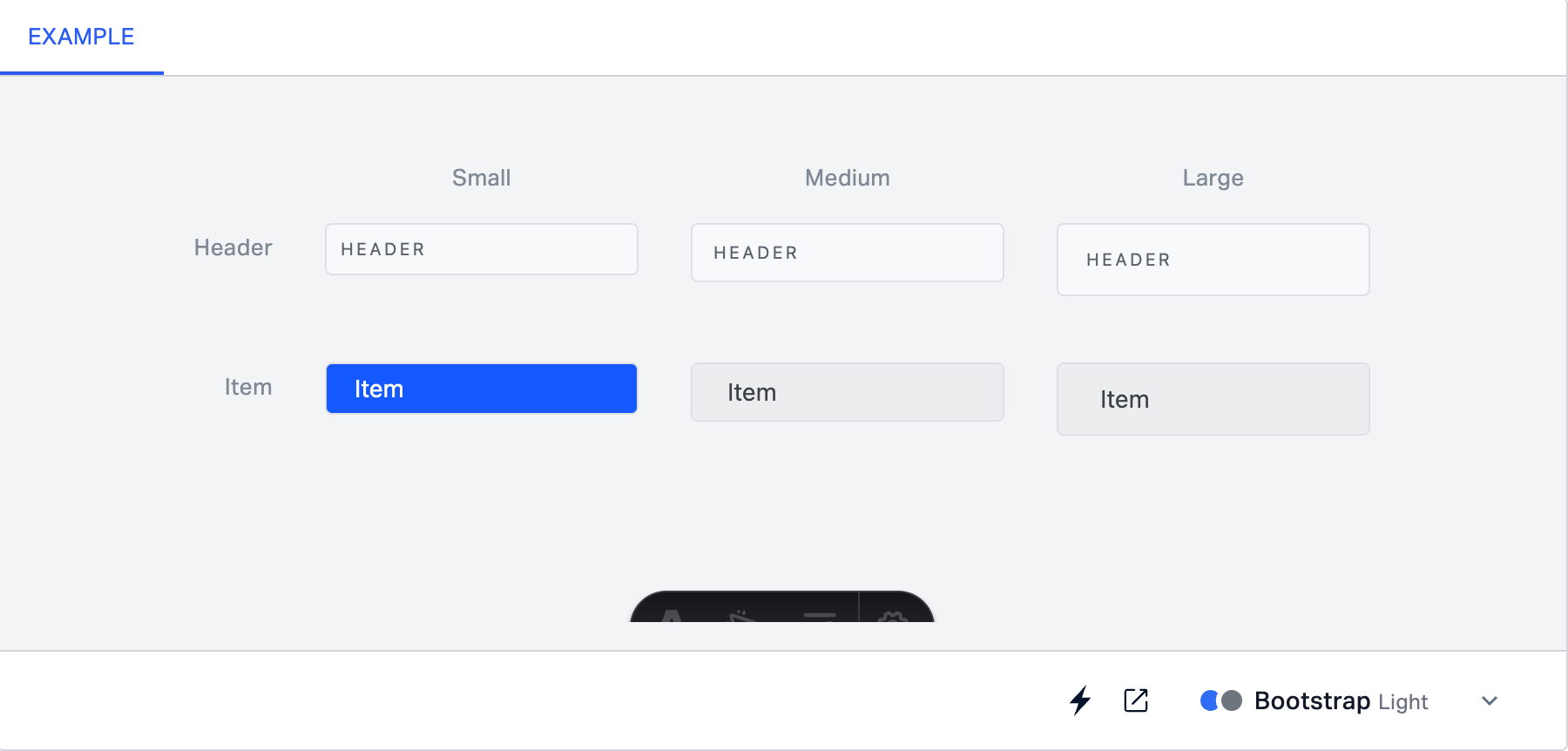
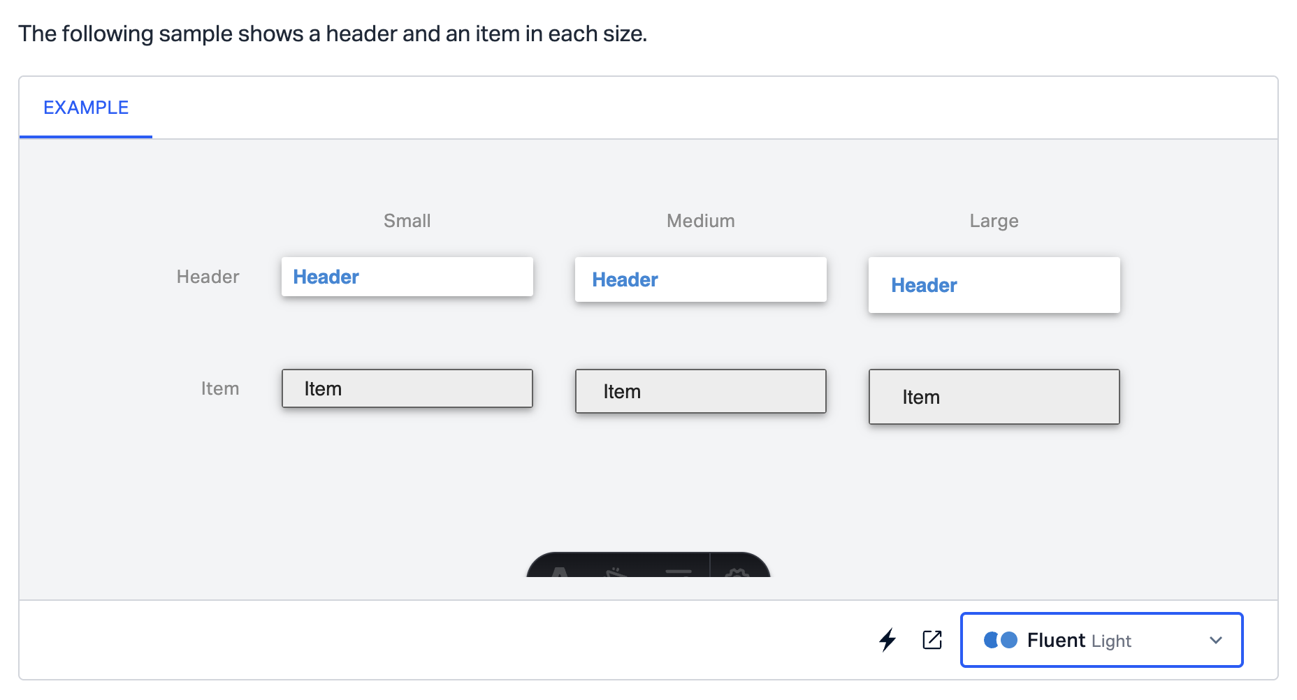
The following sample shows a header and an item in each size. Since the frame is read-only items shouldn't be selectable.
Screenshot 2026-11-11 at 18 02 24

@DiLazarova

DiLazarova commented Nov 11, 2026 •

Copy link
Copy Markdown
Contributor

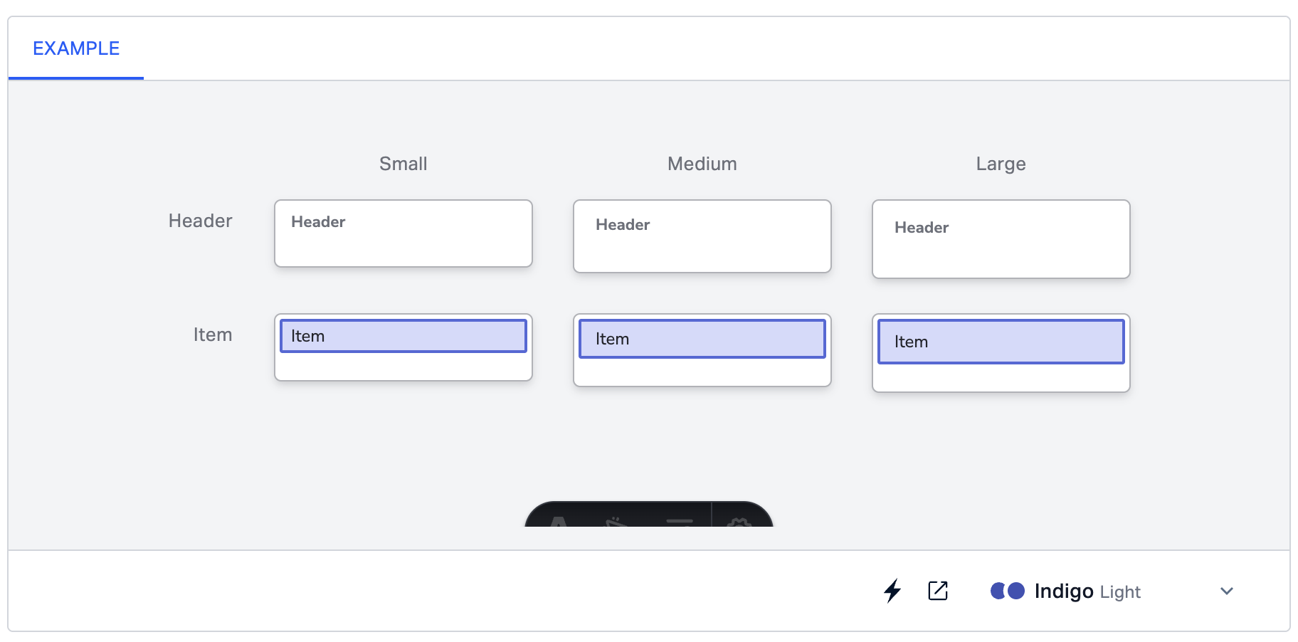
Dropdown item section

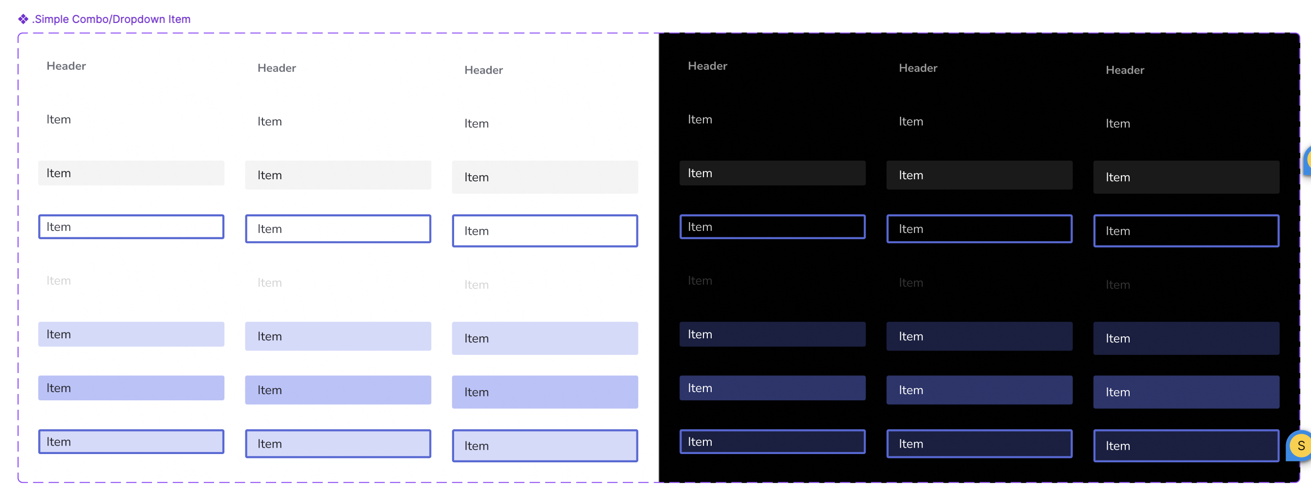
The Dropdown items in Indigo looks weird:
Screenshot 2026-11-11 at 18 08 07

UI Kit:
Screenshot 2026-11-11 at 18 06 26

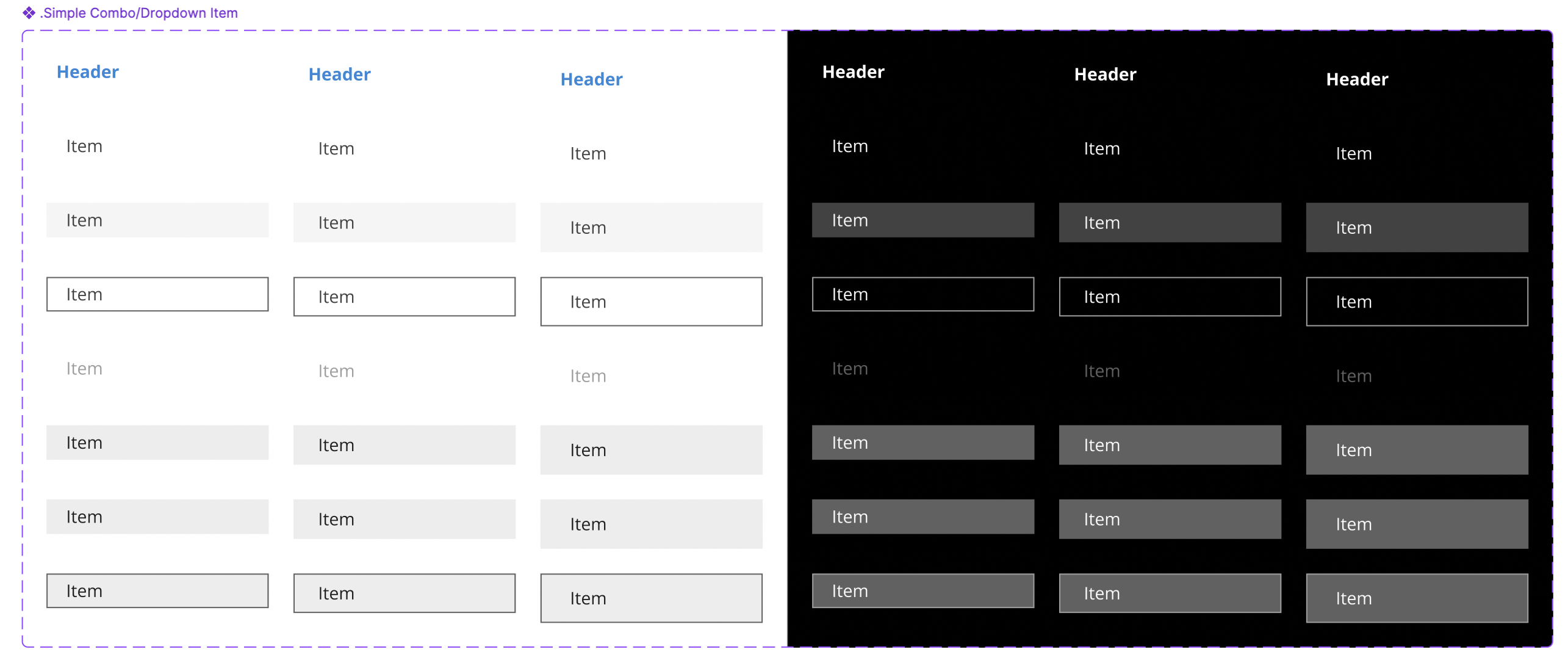
Also Fluent - there is now shadow like the example.
Screenshot 2026-11-11 at 18 12 08

UI Kit:
Screenshot 2026-11-11 at 18 12 41

The same problem appears in Dropdown Items Section!

@DiLazarova

DiLazarova commented Nov 16, 2026 •

Copy link
Copy Markdown
Contributor

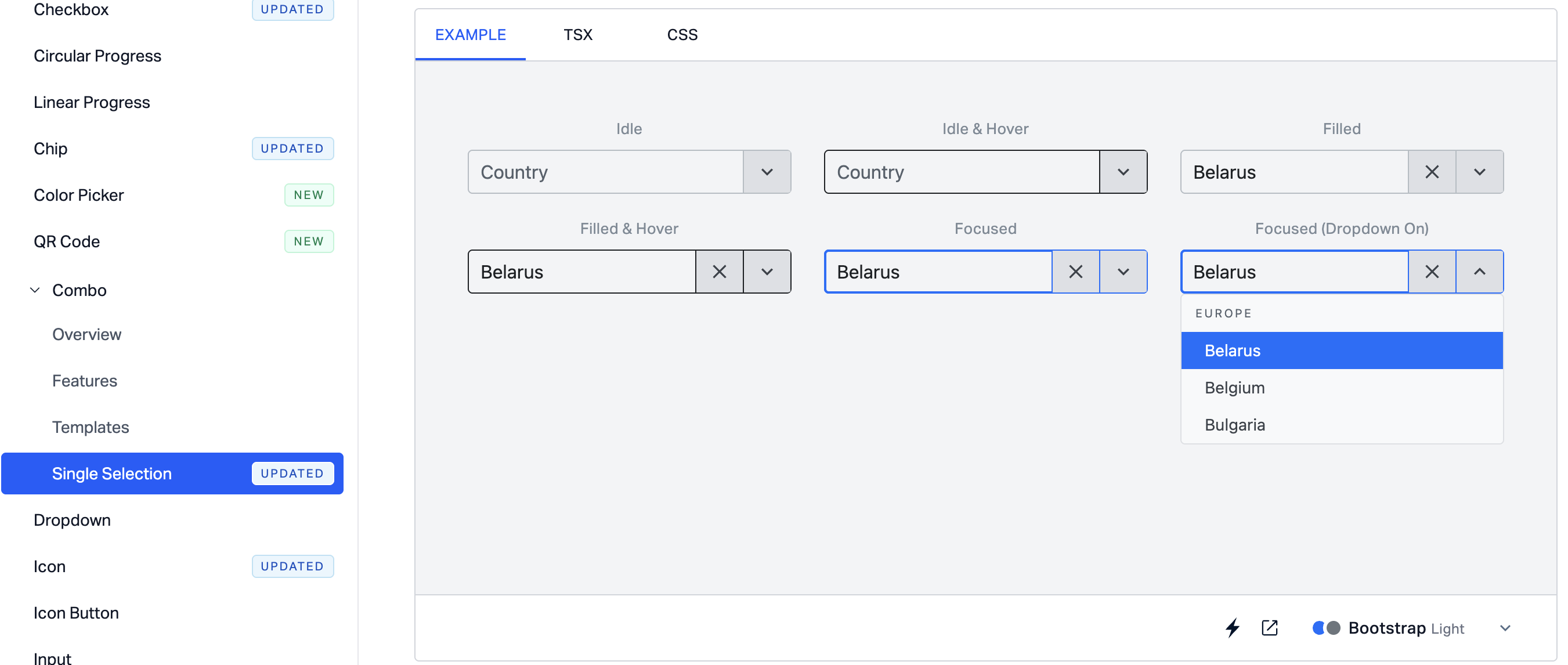
This should be read only section with no header and no icons in the footer. Only the theming option remains. The Focused States in Bootstrap are not correct. The same is relevant for "Validation States" Section too.
Screenshot 2026-11-16 at 15 34 59

Sign up for free to join this conversation on GitHub. Already have an account? Sign in to comment

Labels

doc-redesign simple combo IgxSimpleCombo component status: ✔️ by-design ❌ status: awaiting-test PRs awaiting manual verification

Projects

None yet

Development

Successfully merging this pull request may close these issues.

inputs/combo/single-selection.mdx

2 participants